Pause Sensory Room & Mobile App
2022
Role
UX Designer/ UX Researcher
User Research, Wireframing, Visual Design, Prototyping, User Testing
January 2022 – May 2022
Overview
I took a course at Michigan State called the iOS Design Lab at the MSU Innovation Center during the fall semester of 2021 through the spring semester of 2022. In this class we focused on utilizing the Apple ecosystem to create and design digital and physical products. I worked with a team of nine other MSU students to create a product that was aimed to lower stress levels of students at Michigan State University.
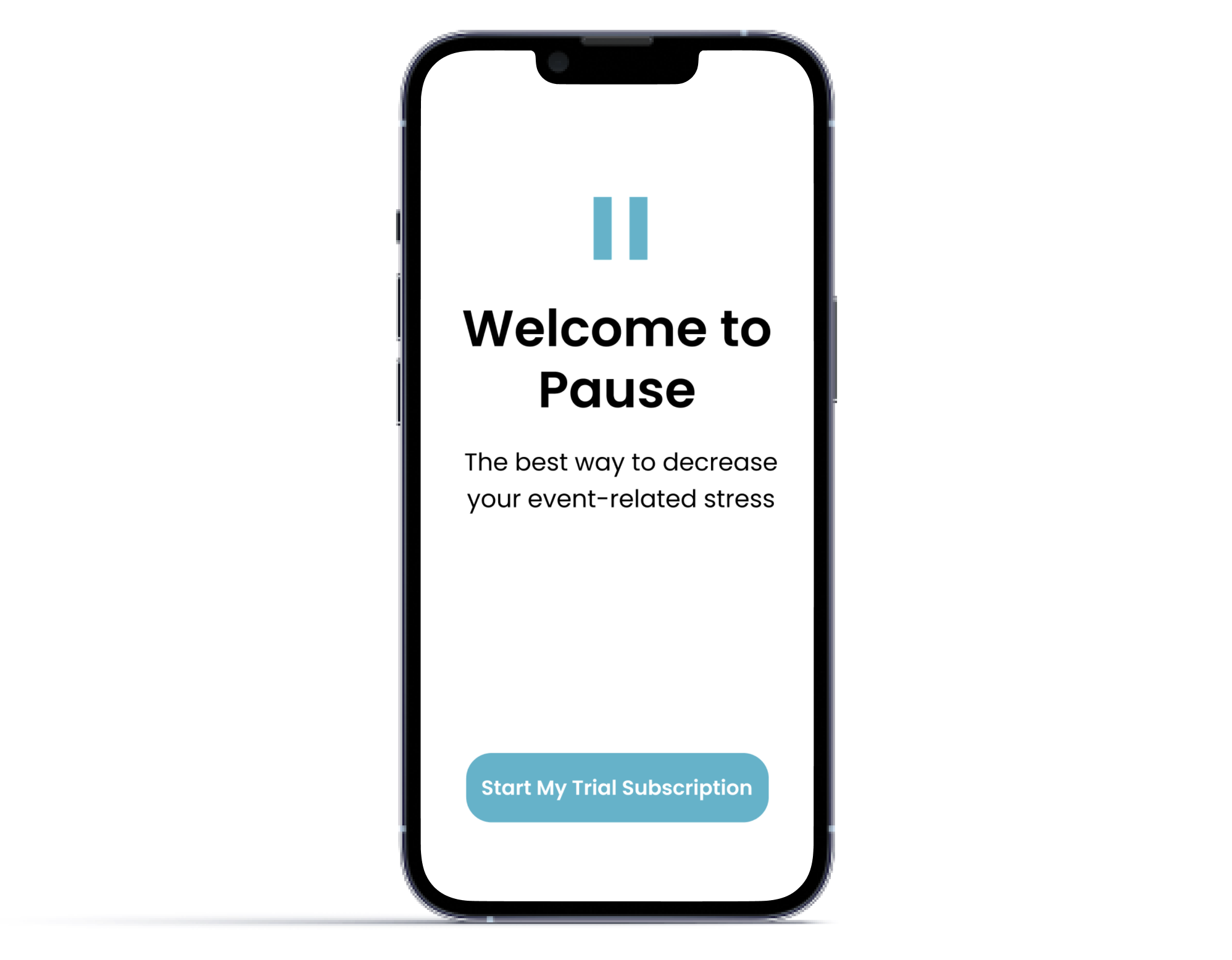
We created a prototype for an app called Pause which aimed to be an application where users could sync their digital calendar, choose a destresser to conduct before a stressful event (exams, sports game, job interview, etc.), and personalize their reminders to set up a time to do a destressor before an event.
Background
The MSU iOS Design Lab is a one-of-a-kind university experience and is made up of students from various colleges and programs from within MSU. In the Lab, we work in diverse teams to discover issues within our communities and design impactful solutions using the Apple ecosystem. Currently, the iOS Design Lab is designed as a one-year cohort-based experience.
I was 1/9 of the team
I applied for the MSU iOS Design Lab in May of 2021 and I was accepted into the lab for the fall semester in June of 2021. In the fall semester, our team consisted of 17 people with various backgrounds and majors, but as we entered the spring semester, only 9 team members came back.
I’ve grown so much during my time at the MSU iOS Design Lab, some key achievements of which I have listed below:
Implemented a design process. By understanding and knowing how to utilize the design thinking process, this helped our team find structure and organization during the course of our projects.
Discovered individual strengths. Our small team was split into two other teams, which consisted of a content team and a tech team. By identifying our individual strengths, we were able to utilize them in our teams.
Established a design theme. This helped to maintain the look and feel of the overall product.
Implemented usability across the product. By constantly conducting user testing, we were able to incorporate human-centered design as the main focus of the final product.
Our team really focused on and implemented the design thinking process into our work. We aimed to incorporate Empathizing, Definition, Ideation, Prototyping, and User Testing in all parts of our projects.
Gathering Insights
After collecting research through analytics and comparative analyses, our team decided on creating a sensory room to have accessible to students on campus.
Sensory Room
The purpose of the sensory room was to help in calming stressed students. If someone had an important exam, a job interview, or a presentation, etc., they would be able to utilize our sensory room to manage their stress before an important event. Most of our research was focused around an idea of a sensory room.
Teams
Our team was separated in to a technical group, a content group, and a project manager. The technical group was in charge of finding Apple devices to use to enhance the experience for our users. They were also tasked with deciding how the experience would look to the user. They decided on using a regular projector, a mapping projector, speakers placed around the room for surround sound effect, and lighting bars. Two of our team members were on the technical team while the rest of use were assigned to the content team.
Content Team
The content team was in charge of finding content to use as visuals and sound. We decided to focus on nature videos and nature sounds because our research led us to find out that nature sounds and visuals are proven to be calming. As a member of the content team, I really wanted to use my phototgraphy and videography skills to create a great visual. I went on a spring break trip to Sarasota, Florida during February of 2022 and I took some video of the ocean and palm trees. We were able to use my visuals for one of the two “themes” we let our users choose from.
Visuals
User Testing
Our final solution consisted of a sensory room prototype experience for MSU students. In our research, we found that an effective way to monitor stress levels was to use a heart monitor. Apple watches have a function in the workout app that tracks the heart rate of anyone wearing the watch. We gathered about 8 MSU students who had volunteered to be a part of our user testing. Each user was instructed to take a pre-test survey when they first arrived. This survey asked them questions about their anxiety levels in that moment, every day, and what emotion they were generally feeling every day. While they were taking the survey, the users were to wear the Apple watch for 3 minutes to monitor their heart rate.
When the 3 minutes were up, the user was instructed to follow a team member back to the waiting room and take a post-test survey. We made sure to take the Apple watch off as soon as they came back to the room. The post-test survey consisted of the same questions in the pre-test survey.
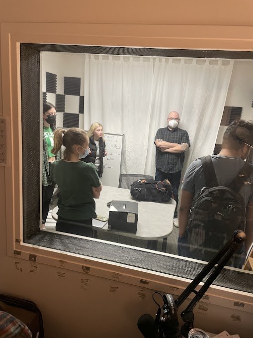
After the user had completed the pre-test survey and wore the heart monitor for 3 minutes, they were instructed to follow one of our team members to a recording studio. In this 7 x 7, 4-wall recording studio was our setup of the sensory room. The user was then told to sit in a chair in the middle of the room while the lights were turned off. The projector would turn on and show them either a visual of the ocean or the forest. Nature sounds were played, mapping projectors projected images on the side walls to add to the visual experience, and lighting sticks produced colored light to match the visual colors. The user was to sit in the room for 3 minutes.
Usability Test Results
Our final results showed inconclusive data in the heart rates of our users, which led to us not being able find out if the stress levels of our users had gone up or down during the user testing. Because of our limited time on this project, we decided as a group to move on to a different final product instead of continuing with our room. This led us to create Pause.
Switching gears
While moving through the design thinking process, we started to think about ways we could utilize the Apple ecosystem to create an app. Mobile applications are something students always have access to, so we started to brainstorm possible ideas for an app that would aim to relieve stress and anxiety in students at Michigan State. My team realized that student stress is often driven by stressful events such as exams, homework due dates, essays, sports games or competitions, etc. We started to think about how we could help students manage their stress around these stressful events.
Based on our research and branching off of our unsuccessful sensory room, my team understood that taking a few minutes of ones time to pause, breathe, relax, or meditate is effective at reducing stress levels and anxiety. We wanted our final product to produce lower stress rates in students when going into stressful events.
The content team that I was a member of for our sensory room was then separated even more into a visual group, a UI group, and another content group. I was a member of the visual team with one other team member, Hannah. We were in charge of deciding on the color theme, the font style, and the images and icons. After a lot of research, we discovered that blue is known to be a calming color. We put together a color palette of different types of blues. We then went with the font of Apple, SF Pro. This font is easily readable, clean looking, and goes with the Apple theme. We then looked at icons and decided to stick with academic icons. In our style guide, we used a paper and pencil icon, a calculator icon, and a printer icon. (These icons were changed and moved around in our final product.) Finally, I decided on an image of the ocean to remind us of our first project, the sensory room. The ocean is light blue which matches our color scheme.
Style Guide
The Solution
The final solution consists of a final prototype for an app called Pause. This prototype has four different tabs. The first tab is the “Home” page. On this page, users can upload a new event, the date of the event, and set a time to receive a reminder for that event. The user can also personalize the background picture for each event.
The next tab is the “Calendar” tab. This section lets users upload their event in the calendar which will show up on the “Home” page. They can also view their calendar as a list or in the form of a default calendar.
The next tab is called the “Destresser” tab. This section lists many different way to destress. The four sections include “Breathing,” “Meditation,” “Social,” and “Other.” The user can pick from any of these techniques to perform before their event and it gives them the option to personalize their experience. The user can also add their own distressed if they do not want to perform any of the listed techniques for distressing.
The final tab is called “Settings.” This tab allows the user to connect their digital calendar from many different platforms. They can also choose the language in which they want to read everything on the application.
Our team was so successful in creating this prototype, we were asked to present to the Apple Developer Academy in Detroit, Michigan. This experience was a way for us to share all of our work to a group of UX students and professionals, Apple developers, and the UX community.


