2023
Catch Mobile App
Role
UX Designer/ UI Designer
Wireframing, Visual Design, Prototyping
May 2023 – July 2023
Overview
I started my internship with Fusionary in February of 2023. During my time as a UX intern, my coworker, aka the other half of the design team, went on maternity leave in March. This left me in a position where I was on my own, and taking ownership of incoming projects would be a very important skill to learn in my position.
Background
I was 50% of the Design team
Fusionary is a software development company out of Grand Rapids, MI. They specialize in partnering with companies and helping them create their vision in the form on an online platform. Catch Transportation came to us in 2022 but we were not able to work on their app until May of 2023. They were looking for a transportation app that would allow groups with two or more people to split the cost in the app that was associated with the event transportation.
While only working at Fusionary for a few months, I was tasked with creating an app for Catch Transportation. The goal of this app was to help groups wanting to book an event that required transportation, split the payment between individuals and prevent the messiness of making sure everyone Venmos the event organizer.
I’ve grown so much during my time at Fusionary, some key achievements of which I have listed below:
Taking ownership. Because I was handed this project as an intern with little experience, I was forced to take ownership and show my team that I could make something great in the end.
Becoming a great communicator. While working on this project on my own, I needed some guidance from my boss. I learned that communicating really well and staying on the same page with them would be very beneficial.
Being creative in my own unique way. I was trusted to make something great on my own initiative and my creative abilities were tested.
Implementing usability across the product. I knew it would be very important to always keep the user in mind during the mockup process, so I always kept in mind what it would be like to be a user on this app.
I was tasked with designing an app on my own initiative.
Starting Out
I was given the Catch Transportation project to build off of the existing wireframes that were created the year before. I wanted to go above and beyond with this project as this was my first big project by myself, so I ended up using the wireframes as inspiration for my own version of the first mockup.
Strategy
I was able to learn all about the discovery of this project by reading through the statement of work (SOW) document that was created the year before. I also made sure to look through all of the existing wireframes and information architecture maps to learn the background as best as I could and be prepared to start new wireframes that matched the scope.
Planning
Once I felt confident in the scope of the app, I started to recreate the wireframes page by page.
Design
I focused on keeping all of the important elements in my designs and only creating new ones where they were needed. I ended up changing things a lot more than I expected, but I believed my designs would be more efficient than the original wireframes.
First Mockup
The first mockup consisted of a home page, a quote page, a reservation page, and an account page. Because I was in the early stages of design, most of the elements were in black in white. At this point we had been given a brand guide by the client, so I knew vaguely how to move forward with the visual design. The home page consisted of a “Suggestions” section, a “Choose your ride” section, and a map to show Catch drivers near you.
The map concept was inspiration from the Uber app. Because Catch only does reservations, the map would not work out in the newer wireframes and mockups. The quote page showed a form with open answered form fields, multiple choice radios, and dropdown menus. Once a user filled out the form and submitted it, they would get a quote
back from Catch. The reservations page was created to show all of the events and pending quotes a user would have side by side. This was supposed to show which events were coming up, events that had passed, declined events, and pending quotes.
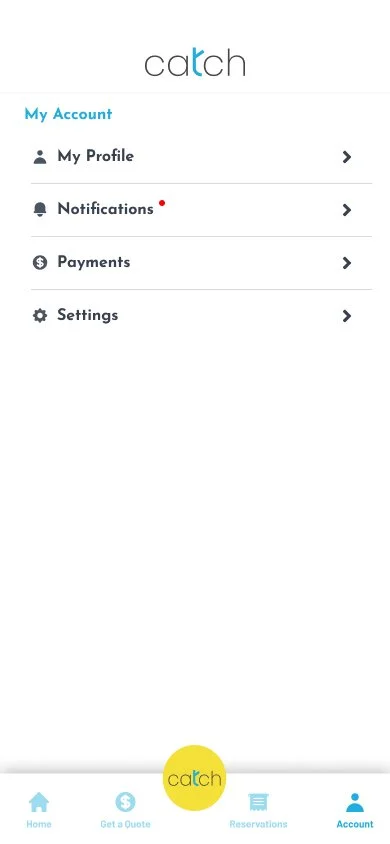
Finally, the account page was a way to access a user’s settings in the app. Instagram inspired me for this page, so I created a “my account” tab, a “notifications” tab, a “payments” tab, a “privacy” tab, a “security” tab, a “help” tab, and an “about” tab. There weren’t any pages that these accordians could actually link and it ended up being a lot of unneeded information, so we decided to narrow it down in the second mockup.
Second Mockup
Second Mockup
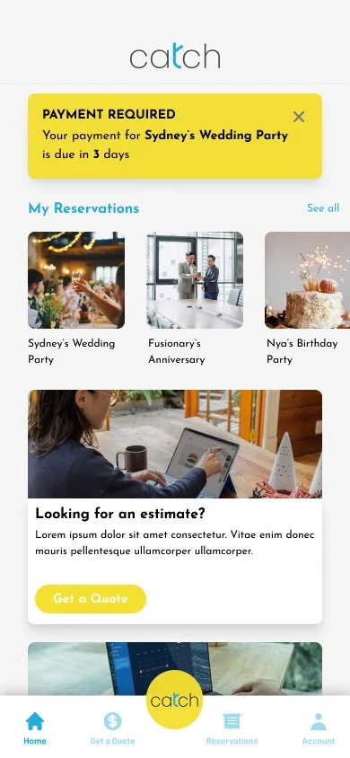
The second mockup featured a more detailed, scope-following home page. This page showed a new concept for showing a user’s reservations right away. I also kept the “find a reservation” and “get a quote” cards. Another new feature was creating a notification at the top of the page to alert a user if there was a pending quote.
The quote page and reservation page were the same as the first mockup, but the account page changed a little bit. Instead of having a vague account menu with elements that weren’t needed, the user had the option to look at their account information such as their name, email, phone number, and username and password. They also had the option to toggle notification settings and privacy settings. The user also had the option to control payment methods that were saved in their account.
The Solution
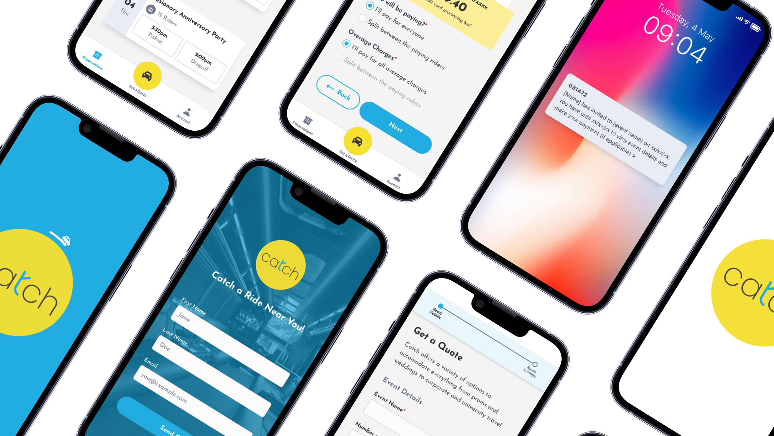
The final solution consists of a mockup for an app called Catch made for Catch Transportation. This mockup goes through four different types of flows created for an Event Organizer, a Paying Rider, a Paying Rider Transfer, and a Non Paying Rider. has four different tabs.
The first flow starts on the splash screen, the user would then login, then they are met with the reservations page. Once there, they can see all of their upcoming reservations and pending quotes. If they don’t have any events coming up, the user can request a quote. They can fill out the quote form and wait for Catch to reply back with a quote.
Once a quote is sent to the event organizer, they can accept, decline, or wait on signing the reservation. If the reservation is accepted, the user will have to answer some questions regarding payment splits and overage charges, and decide how many people they want to add as paying riders.
Next, the event organizer will need to sign a contract for their event. Finally, the user will schedule a payment that will automatically be deducted from their card on file in their account. This payment will cover half of the event. All paying riders are given 72 hours to cancel their spot or add more paying and non paying riders. Once everyone had signed their contract and scheduled their payment, they cannot remove themselves from the event unless a new paying rider takes their spot. Otherwise the event organizer will be responsible for that paying rider’s payment.
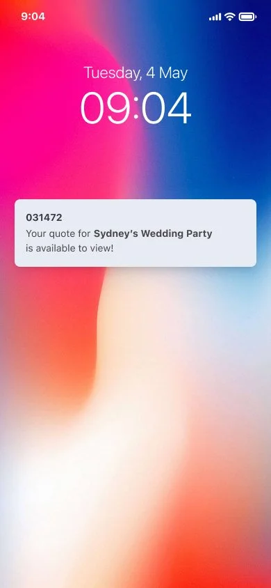
The second half of the payment is due 7 days before the event date. The app will automatically deduct the payment from the card that is saved in the user’s account. Users have the option to receive notifications, view the status of other paying members’ payment, and remove and add a payment method in their account.
The Prototype
Currently, this app is in the process of development and will be released at the end of 2023.
Catch final prototype
Paying ride transfer prototype
Paying rider prototype
Non paying rider prototype

